- Display dynamic payment messaging that updates based on cart values.
- Customize messaging to match your site’s design with various logo types, positions, and color schemes.
- Implement detailed analytics tracking.
- Support multiple integration patterns (HTML, JavaScript, or hybrid) based on your technical requirements.
Configuration overview
There are 3 primary ways to add and configure messages for your website:- HTML configuration: An HTML configuration uses web component attributes and minimal JavaScript to load and render messages to the page. The only JavaScript that you need for this integration is to initialize the SDK and create a PayPal Messages instance.
- JavaScript configuration: A JavaScript configuration uses minimal HTML and relies on JavaScript to configure and load message content. The only HTML that you need for this integration is to add the
paypal-messagesweb component to your page. - Hybrid (HTML with JavaScript) configuration: You can use a hybrid configuration (HTML and JavaScript) for advanced message options. This approach fetches and sets content using both HTML attributes and JavaScript options.
Load the messages component
There are two ways to load themessages component of the v6 SDK:
- Include an HTML
scripttag with the v6 SDK core script. - Load the component through JavaScript when you create the v6 SDK instance.
The paypal-message SDK component
Thepaypal-message SDK component utilizes a custom Lit web component, <paypal-messages>, to render Pay Later messages on a webpage. Web component methods and Web component attributes tell you more about how to use this SDK component.
Web component methods
Accessing the<paypal-messages> web component using JavaScript exposes some methods, which the following table describes.
| Method | Description | Arguments | Return value |
|---|---|---|---|
setContent | An exposed method to set the content of the message component | Message content that the payPalMessages.fetchContent() method returns | void |
getFetchContentOptions | Extracts and returns the fetchContent configuration options from the component’s HTML attributes and properties | None | A content object that it constructs from the HTML attributes for the web component |
Web component attributes
The<paypal-messages> web component accepts a variety of attributes to control how a message looks and what it does. Some options are available only through the fetchContent method. For more information about using fetchContent, see Fetch content options.
| HTML attribute | Description | Default value |
|---|---|---|
amount | Number string with as many as 2 decimal places to represent dollar amounts. Set using JavaScript as a fetch content option. Example inputs: "50" → $50.00 "50.5" → $50.50 | None |
auto-bootstrap | If true, PayPal’s data layer (PayPalMessages) automatically picks up this component to fetch content. If false, you must use fetchContent. | false |
currency-code | A string value of length 3 to represent the currency code of the message. Set using JavaScript as a PayPal messages option and a fetch content option. | None |
logo-position | A string value that indicates where to place the message branding. Set using JavaScript as a fetch content option. Options: INLINE LEFT RIGHT TOP | LEFT |
logo-type | A string value that indicates the desired branding style. Set using JavaScript as a fetch content option. Options: MONOGRAM: If logo-type is MONOGRAM, logo-position must be LEFT. TEXT: If logo-type is TEXT, logo-position must be INLINE.WORDMARK | WORDMARK |
presentation-mode | A string value that indicates how to load a message’s Learn More presentation. Set using JavaScript as a Learn More option. Options: AUTO MODAL POPUP REDIRECT | AUTO |
text-color | A string value that indicates the message color to use. Set using JavaScript as a fetch content option. Options: BLACK MONOCHROME WHITE | BLACK |
JavaScript interface
Create a PayPal Messages instance after you create a v6 SDK instance. The following code snippet is the minimum JavaScript requirement for rendering a message.Instance methods
A PayPal Messages instance has 2 primary, exposed methods. You can use these methods to configure message content and to present Learn More links.| Method | Description | Arguments |
|---|---|---|
fetchContent | Fetch message content from the server. | An optional object of Fetch Content Options |
createLearnMore | Initialize and return a Learn More presentation. | An optional object of Learn More presentation options |
Instance options
When you initialize PayPal Messages withcreatePayPalMessages, you can pass global configuration options. These options apply to content requests for each message that you configure on this page. For example, if the page contains multiple message elements, and each one has a currency-code attribute, then you can configure currencyCode in the createPayPalMessages call, so you don’t have to configure it in each of the elements.
| Option | Description | Default value |
|---|---|---|
currencyCode | 2-digit string that is the currency code for the buyer’s country Set using JavaScript as a fetch content option or using HTML as a web component attribute | None |
shopperSessionId | A string that represents the shopper’s session ID in this basic format: 6B29FC40-CA47-1067-B21D-00DD010462DA |
Fetch content options
When you use thefetchContent method, you can pass a variety of options to configure the content of a message.
| Option | Description | Default value |
|---|---|---|
amount | Number string with as many as 2 decimal places to represent dollar amounts Set using HTML as a web component attribute Example inputs: "50" → $50.00 "50.5" → $50.50 "50.55" → $50.55 | None |
currencyCode | 3-digit string that is the currency code for message Set using JavaScript as a fetch content option or using HTML as a web component attribute | None |
logoPosition | A string value that indicates where to place the message branding. Set using HTML as a web component attribute. Options: INLINE LEFT RIGHT TOP | LEFT |
logoType | A string value that indicates the desired branding style. Set using HTML as a web component attribute. Options: MONOGRAM: If logoType is MONOGRAM, logoPosition must be LEFT. TEXT: If logoType is TEXT, logoPosition must be INLINE.WORDMARK | WORDMARK |
onContentReady | A callback to send when content is received from the server during a call to the fetch content method. This callback takes precedence over onReady. | None |
onReady | A callback to send when content is received from the fetch content method. This could be content from the local cache or from a server. If you omit onContentReady or onTemplateReady, the system uses this callback. | |
onTemplateReady | A callback to send when content is received from the local cache during a call to the fetch content method. This callback takes precedence over onReady. | None |
textColor | A string value that indicates the message color to use. Set using HTML as a web content attribute. Options: BLACK MONOCHROME WHITE | BLACK |
Learn More options
Learn More links typically follow Pay Later messages, and they link to additional information about available Pay Later offers. These links can appear as modals, popups, or redirects to a new tab. When you call thecreateLearnMore method, you can use the following options to configure the Learn More presentation.
| Option | Description | Default value |
|---|---|---|
amount | Number string with as many as 2 decimal places to represent dollar amounts. Set using JavaScript as a fetch content option or using HTML as a web content attribute. Example inputs: "50" → $50.00 "50.5" → $50.50 | None |
presentationMode | A string value that indicates how to load a message’s Learn More presentation. Set using HTML as a web content attribute. Options: AUTO MODAL POPUP REDIRECT | AUTO |
onApply | A callback to send when the user selects the Apply button or link in a Learn More presentation. | None |
onCalculate | A callback to send when the user the user enters a value in the Amount input field in a Learn More presentation. | None |
onShow | A callback to send when a Learn More presentation is shown. | None |
onClose | A callback to send when a Learn More presentation is closed. | None |
SDK instance options
PayPal Messages also uses some top-level SDK instance options. The following part of your code provides these options.| Option | Description | Default value |
|---|---|---|
clientId | Recommended. Your PayPal client ID. Note: You cannot use a client token and a client ID. You must choose 1. clientId is preferred for most integrations. | None |
clientToken | A unique identifier for merchant authentication. | None |
pageType | A string that represents the page on which the message appears. Options: cart checkout home mini-cart product product-details product-listing search-results | None |
partnerAttributionId | An identifier for partner integrations. | None |
shopperSessionId | A string that represents the shopper’s session ID in this basic format: 6B29FC40-CA47-1067-B21D-00DD010462DA | None |
Cascading Style Sheet (CSS) properties
For styling parts of messages, you can use 2 custom CSS properties.| Option | Description | Default value |
|---|---|---|
--paypal-message-font-size | Specify the font size for the message in px from 10px to 16px. If you specify a value that is outside of this range, the message will use the closest value that is in this range. For example, if you try to use 4px, the message uses 10px. If you try to use 24px, the message uses 16px. | 14px |
--paypal-message-text-align | Alignment of the message: left right center | left |
Message configuration examples
These examples show how the different configurations work to create a Pay Later message with a Learn More link. For examples of some of the different configuration options, see Message configuration examples.- HTML
- JavaScript
- Hybrid (HTML with JavaScript)
The HTML configuration uses web component HTML attributes and minimal JavaScript to load and render messages to a page. The only JavaScript that you need for this integration is to initialize the SDK and create a PayPal Messages instance.When you put it all together, this is the full code sample.
- To use v6 SDK messages, include 2 scripts on your site: the core SDK package and the PayPal messages SDK package.
- Add the
<paypal-message>web component to your page. If you use theauto-bootstrapattribute, PayPal’s data layer (PayPalMessages) automatically picks up this component to fetch content. If you do not useauto-bootstrap, you must use thefetchContentmethod to fetch and set content.
- Create the core SDK instance using your client ID, and instantiate PayPal Messages.
Note: Canadian merchants may optionally pass the locale parameter to control language behavior. Uselocale=fr-CAon your French site andlocale=en-CAon your English site. If the customer does not pass thelocaleparameter, the customer’s browser language determines the locale. If the browser language isfr-CA, the message renders in French(fr-CA). For all other cases, messages render in English(en-CA).
- Add a way to update the PayPal Message
amount. This code sample shows how to update theamountattribute on the PayPal Messages web component.
Message styling
You can use custom CSS properties and change the logo type and text colors to customize the style of a message.Note: PayPal Debit Card and PayPal Cashback Mastercard are incompatible with theThe following examples show some ways to use these styling options.INLINElogo position. If you useINLINEfor the logo position for these payment methods, messages use the default value ofLEFTinstead.
Learn More configuration patterns
The message configuration patterns in Message styling use the default Learn More presentation. You can use JavaScript to customize these presentations. The following code example shows how to customize a specific PayPal message’s Learn More presentation that opens when a user selects it. This sample also adds an event listener to thepaypal-message-click event.
Pay Later message examples
Using the options that this page describes, you can create a variety of Pay Later message styles. The following examples show some of the different styles that you can create.| Description | Settings | Example |
|---|---|---|
| Monogram | logoType: "MONOGRAM" |  |
| Monochrome monogram | logotype: "MONOGRAM" textColor: "MONOCHROME" | 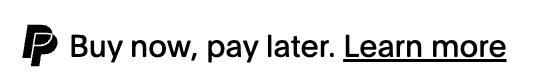 |
| White monogram | logoType: "MONOGRAM" textColor: "WHITE" |  |
| Monogram and PayPal wordmark | logoType: "WORDMARK" |  |
| Monochrome monogram and monochrome wordmark | logoType: "WORDMARK" textColor: "MONOCHROME" |  |
| White monogram and white wordmark | logoType: "WORDMARK" textColor: "WHITE" | 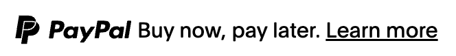 |
| Inline wordmark | logoPosition: "INLINE" logoType: "WORDMARK" |  |
| Inline monochrome wordmark | logoPosition: "INLINE" logoType: "WORDMARK" textColor: "MONOCHROME" | 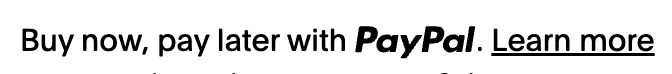 |
| Inline white wordmark | logoPosition: "INLINE" logoType: "WORDMARK" textColor: "WHITE" |  |
| Text | logoType: "TEXT" |  |
| White text | logoType: "TEXT" textColor: "WHITE" |  |
| Monogram and credit wordmark | logoType: "MONOGRAM" |  |
| Monochrome monogram and credit monochrome wordmark | logoType: "MONOGRAM" textColor: "MONOCHROME" |  |
| White monogram and white credit wordmark | logoType: "MONOGRAM" textColor: "WHITE" |  |
| Monogram wordmark and credit wordmark | logoType: "WORDMARK" |  |
| Monochrome monogram and monochrome wordmark with monochrome credit wordmark | logoType: "WORDMARK" textColor: "MONOCHROME" |  |
| White monogram with white wordmark and white credit wordmark | logoType: "WORDMARK" textColor: "WHITE" | |
| Inline wordmark and credit wordmark | logoPosition: "INLINE" logoType: "WORDMARK" |  |
| Inline monochrome wordmark and monochrome credit wordmark | logoPosition: "INLINE" logoType: "WORDMARK" textColor: "MONOCHROME" |  |
| Inline white wordmark and white credit wordmark | logoPosition: "INLINE" logoType: "WORDMARK" textColor: "WHITE" |  |
| Credit text | logoType: "TEXT" |  |
| White credit text | logoType: "TEXT" textColor: "WHITE" |  |